A data series is a set of data that is displayed on a chart or table. For example, a pie chart or serial chart showing lines, columns, bars, or areas relies on a series of data to render its display. In a table, data series are used to render the table's rows. With a serial chart, more than one series can be displayed at a time.
You can think of a series as an array of name-value pairs. Each instance of a name-value pair in the array is a data point. When plotted on a chart, each data point has a shape. For example, on a pie chart, the shape of each data point is a circular selector (slice). On a serial chart with columns, each data point is a vertical rectangle.
The data sources for dashboard elements are layers, and each layer has one or more columns of attributes. To plot a chart, a series from the layer's underlying data must be created. You have three options for this: Grouped values, Features, and Fields.
Grouped values
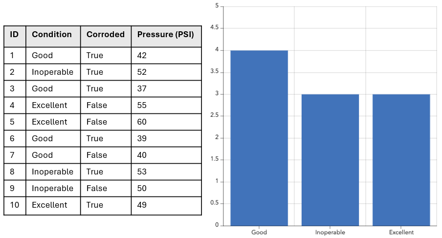
The Grouped values option relies on data aggregation to create a series. From the raw data, each data point in the series represents a summary statistic (count, sum, average, minimum, maximum, or standard deviation) grouped into categories using a field's unique values in the input layer. For all summary statistics except count, a field from which to gather the summary statistic must also be provided.
In the following example, the Condition field is used to group the raw data into categories. The count of each unique condition is then calculated and plotted on the chart.

Split by
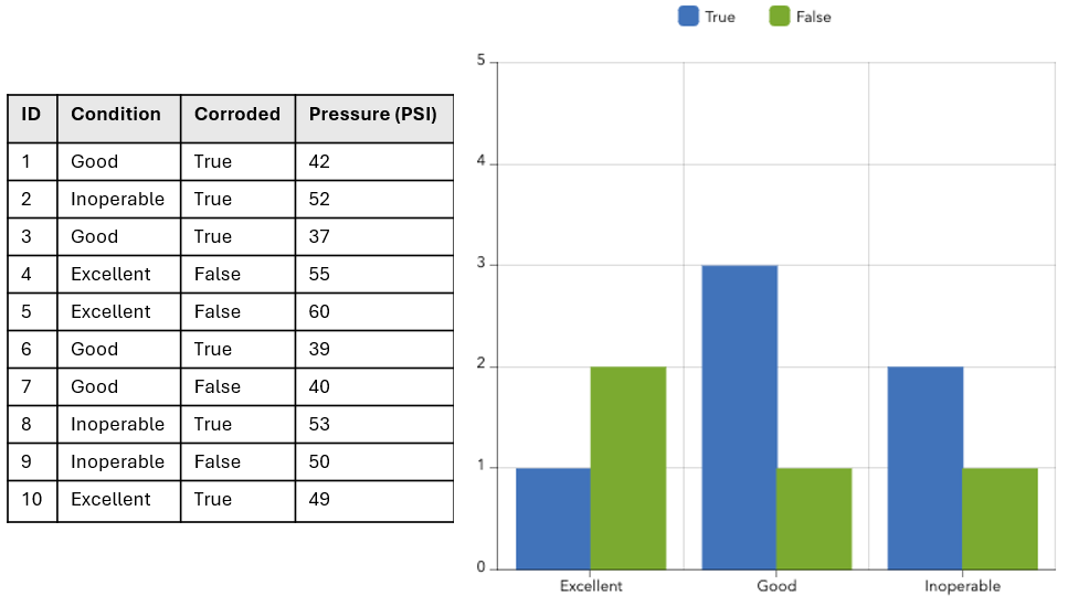
When grouping values into categories on a serial chart, you can specify a split-by field. In this scenario, the input data is split into multiple data series (that is, one series for each unique value in the split-by field). Using the same data as the previous example, you can produce a chart such as the one below by categorizing the data based on the values in the Condition field and then splitting it into multiple series based on the Corroded field.

Features
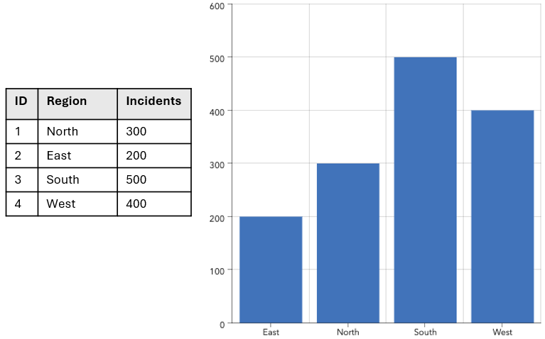
This is the simplest option and causes the chart to draw the fastest. Each feature or row of data represents a data point in the series. It is not necessary to calculate a summary statistic. One field is identified as the category or name field, while another is identified as containing the value to plot.
In the following example, the Region field represents the categories, and the Incidents field represents the value to plot.

Fields
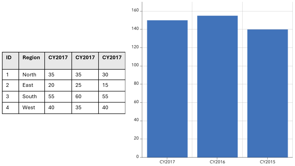
In this scenario, one or more numeric field names are specified to represent the categories. For each field or category, a summary statistic is calculated to create a data point.
Note:
Categories from Fields is only available for serial and pie charts.
In the following example, the CY2017, CY2016, and CY2015 fields represent the categories. The sum of all rows is plotted on the chart.
